

Key takeaways
- Seven of these twelve trending finance thumbnails show a photographed face, and none of them looks shocked. Chins on hands, a shrug, flat stares and worried eyebrows do the work instead.
- Charts are still the shared prop: six of the twelve contain one, and in four a line or bars head down. The frames worth studying do one thing to the chart that the others don't.
- Real places read as evidence. A port, a car park, an aerial view of empty plots and a collage of lifestyle photos stand out in a niche built from graphics.
- Three frames carry no text at all, and they are among the easiest to read at feed size.
- Views do not prove a thumbnail caused anything, and nothing here is investment advice. Borrow the structure, never the image.
Updated 6 November 2026: 8 newer thumbnails were added to this set in two batches. The counts below describe the original twelve from 2 November; the new ones are in Added on 6 November 2026 and Added on 3 November 2026.
Money is one of the hardest subjects to show. A stock price has no face and an interest rate has no location, so finance channels have to build their stakes out of symbols. We took 12 thumbnails from this week's most-viewed finance and business uploads by US channels, which you can browse in the finance thumbnail gallery, and looked at how each one solves that problem.
What stands out across the set is how quickly the symbols converge. Falling lines, stacks of cash and serious faces appear again and again. Those props make a video's topic obvious at a glance. They also make it easy to look like the upload next to you. The frames worth studying are the ones that use the shared vocabulary and then do one thing to it that the others do not.
This article works through those moves and turns them into a brief for your own channel. It is one part of our wider trending thumbnails series, and it deals only with design. Nothing here is investment advice, and we have not checked any figure shown in these images.
How this set was chosen, and what it cannot tell you
YouTube has retired its general trending page, so there is no official finance chart to report. On 2 November 2026 we ran seven finance and business searches with the region set to the United States and gathered the most-viewed uploads of the past week. The region setting changes YouTube's interface but not whose videos rank, so we kept only channels whose About page lists the United States as their country. We then narrowed what was left by hand to one video per channel. The 12 below are our selection, ordered by view count on that date. This is not a YouTube ranking.
Hand selection means some popular videos are missing on purpose. We left out frames built on a politician's face, a frame that insulted a guest in large type, reaction videos centred on private people's debts, and channels that list the US but clearly make their videos for an audience in another country. Inclusion is not an endorsement: some titles below make big promises, and they appear exactly as YouTube shows them because that is the packaging under discussion. A channel's country is whatever it reports about itself, so treat the US filter as a good approximation rather than a guarantee.
The most important limit is this: views do not prove a thumbnail caused the views. A video's count also reflects its topic, its title, the size of its audience and the week's news. Click-through rate is the closest measure of whether a thumbnail earned a click, and only the creator can see it. YouTube's guidance on impressions and CTR says half of all channels and videos sit between 2% and 10%, and our piece on what counts as a good CTR explains why even that needs context. Everything below describes what is in the frame and what it appears to be attempting.
The chart is everyone's prop, so change the chart
Six of the twelve frames contain a chart. That is the strongest shared habit in the set, and it is why the charts that do something unusual are worth looking at closely.
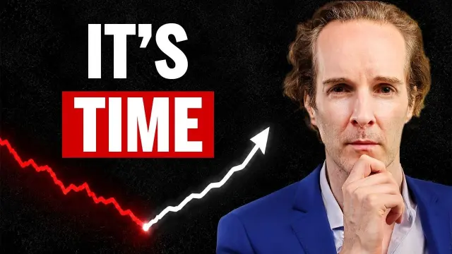
Felix Nikolas Prehn's line tells the whole story in one stroke. It falls in jagged red to a glowing point on a black ground, then turns white and climbs into an arrowhead. The colour change is the argument: the bad part is over, and the turn is now. "IT'S TIME" leaves the object of the sentence to the title, and the presenter, hand on chin, adds calm rather than excitement, which suits a video about patience.
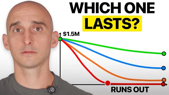
Eric at The PeakFP turns the chart into a race. Four coloured lines leave one dot marked $1.5M and fall at different rates, and the red one hits the floor at a dot labelled RUNS OUT. WHICH ONE LASTS? sits above in black and yellow. The title says he tested four ways to live off the money, and the chart is that test before you have watched it. The winner isn't marked, so the only way to find out which line is which strategy is to click.
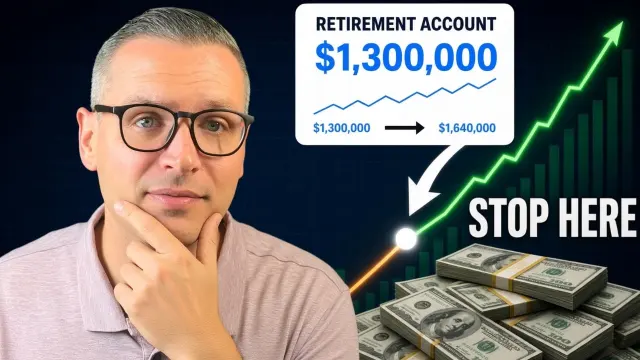
Trevor Phibbs marks a point on the curve. A green line climbs over stacks of cash, a white card reads RETIREMENT ACCOUNT $1,300,000, and an arrow points to a dot on the line labelled STOP HERE. The card makes an abstract target concrete, and the arrow shows exactly where the advice applies. Beside it, he rests his chin on his hand, a near match for Felix Nikolas Prehn's pose.
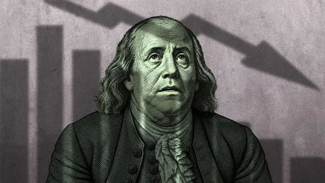
GEN's chart isn't drawn at all. A green, banknote-style engraving of Benjamin Franklin looks up anxiously at a mauve wall, where shrinking bars and a falling arrow appear only as a shadow. There is no text. The bad news exists as a shadow, which fits a title asking why everyone wants you to believe the market is crashing: the threat may not be as solid as it looks.
The move: if you use a chart, do one thing to it. Change its colour at the turn, race several lines, mark one point, or turn it into a shadow. A plain falling line is what the viewer has already seen six times on the same screen.
Concern, never shock
Seven frames show a photographed face, and none of them wears the wide-eyed, open-mouthed look common in entertainment thumbnails. Two rest a hand on the chin, one shrugs, two stare flatly, and one raises worried eyebrows. Money channels are selling caution, and the faces match.
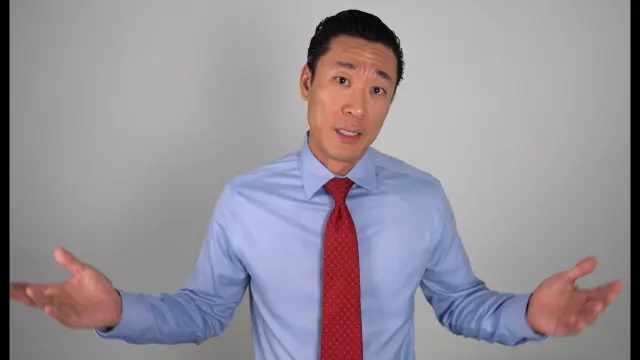
ClearValue Tax's frame is the most stripped down in the set. A man in a pale blue shirt and red tie stands against plain grey, palms turned up in a shrug, looking straight at you. There is no text, chart or prop. The gesture asks "what is going on?", and the title, "Something Is Seriously Wrong at the Federal Reserve", answers it. One clear gesture is enough when the title does the specifics.
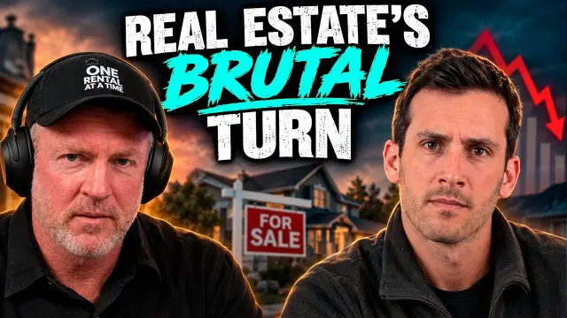
One Rental at a Time uses two flat stares instead of one. The hosts look straight at you, one in headphones and a cap with the channel's name, in front of a house with a FOR SALE sign at dusk while a red arrow and shrinking bars fall behind it. REAL ESTATE'S BRUTAL TURN stacks above them, with BRUTAL in teal italics while the rest is in plain white capitals. Setting the one emotional word in a different style lets it carry the tone without making the faces do it.
The move: pick an expression that matches the advice. A video about caution with a shocked face on it makes two different promises. A shrug, a stare or a hand on the chin promises a considered take.
Real places read as evidence
Four frames use photographs of real places instead of graphics. In a niche built from charts and stock imagery, a location says "this happened somewhere".

The Wall Street Journal's thumbnail is the most viewed in the set, and it has no face and no graphic. A row of white truck gates under green gantry cranes fills the frame, with lorries queuing to pass, and INSIDE CUBA'S NEW ECONOMY runs across the sky in white serif. It is the newspaper's credential in picture form: we went there, and this is what it looks like.

Ben Mallah's frame looks almost unedited. A man in sunglasses points straight at the camera in a car park, with a younger man beside him and a red-roofed apartment block behind. There is no text and no colour grade to speak of. Beside the rest of the set it looks like a location photo, and the building itself is the proof that this video is about a real property.

Real Estate The Ramsey Way puts the place between two people. An older man and a woman sit at podcast microphones either side of an aerial photo of empty plots, each outlined in red, with SMART MOVE? in white on a navy brush stroke. The title is "Land vs Stocks", but only the land appears, which makes it the thing under question.
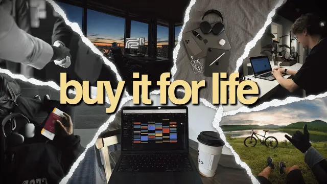
Knowspire builds the place out of many. Torn strips of photo collage fill the frame: a handshake, a city view at dusk, a laptop showing a colour-coded calendar, a coffee cup, a bike beside a lake. "buy it for life" sits across the middle in lower-case cream serif. In a niche of red arrows it looks like a lifestyle magazine, and each strip hints at one of the seven upgrades in the title.
The move: if your video involves a real place, show it. A photograph of the port, the building or the plot is harder to fake than a chart, and viewers read it that way.
Abstract forces need something to look at
Some topics have no place, no product and no chart that would make sense. Two frames found other ways in.
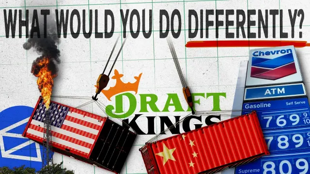
How Money Works hangs the culprits up. Shipping containers painted as the US and Chinese flags dangle from crane hooks, one of them on fire, among a DraftKings logo, a Chevron price sign and a postal logo, all on grid paper. WHAT WOULD YOU DO DIFFERENTLY? runs across the top with a red underline. Each object reads as one item on a list of mistakes, which is the shape of a video titled "If You Were TRYING To Destroy The Economy...".
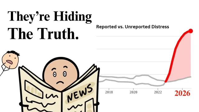
Casual Finance goes plain where everyone else goes dark. On a white ground, a cartoon peers over a newspaper marked NEWS beside a chart titled "Reported vs. Unreported Distress", where a red line pulls away from a grey one towards a red 2026. "They're Hiding The Truth." is set in serif like a newspaper headline rather than an advert. Nothing else in the set looks this bare, which is the point.
The move: when the subject is a system rather than a thing, either collect its parts into one frame or draw a character reacting to it. Both give the eye somewhere to land.
What the twelve have in common, counted
We counted these from the images, so you can check them. Classification is our own judgement, and with only twelve frames it describes this set and nothing wider.
| Observation | Count | Which ones |
|---|---|---|
| Contains a chart | 6 of 12 | Felix Nikolas Prehn, Casual Finance, GEN, One Rental at a Time, Eric at The PeakFP, Trevor Phibbs |
| A line or bars heading down | 4 of 12 | Felix Nikolas Prehn, GEN, One Rental at a Time, Eric at The PeakFP |
| Photographed face | 7 of 12 | Felix Nikolas Prehn, ClearValue Tax, Ben Mallah, Real Estate The Ramsey Way, One Rental at a Time, Eric at The PeakFP, Trevor Phibbs |
| Wide-eyed shock face | 0 of 12 | None |
| No added text | 3 of 12 | ClearValue Tax, GEN, Ben Mallah |
| Headline is a question | 3 of 12 | How Money Works, Real Estate The Ramsey Way, Eric at The PeakFP |
Our classification into the six layout patterns came out as four Reveal, two each of Reaction, Warning and Versus, and one each of Before / After and Number. That spread is wider than the shared props suggest: the charts and serious faces are common, but they are arranged in very different ways.
The extra responsibility of a money thumbnail
A misleading thumbnail on a cooking video costs someone ten minutes. On a finance video it can cost them money. YouTube's spam, deceptive practices and scams policies prohibit thumbnails that mislead viewers about the content, and promoting get-rich-quick schemes falls under the scams rules. Any figure you put in the frame should be one the video actually shows and explains.
Borrow the structure, not the image
Each section above ends with a move: a way of treating a chart, choosing an expression or using a place. Lifting someone's actual chart, face or collage is a different act. It is also useless, because a copy of a recognisable frame tells viewers they have already seen your video.
Added on 6 November 2026
Three days later, four more US money uploads. All four show the creator's face and none of them looks shocked: two rest a hand on the chin or cheek and two look flatly into the lens. Only one uses a chart, and it hides the number its title promises.
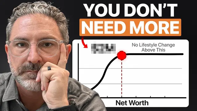
A grey-bearded adviser in clear glasses rests his cheek on one hand at the left of a dark frame. Beside him, YOU DON'T in white and NEED MORE in white on an orange box sit above a white chart: an S-shaped line rises and then runs flat, with a red dot where it levels off, a dashed line down to Net Worth, and the caption No Lifestyle Change Above This. The figure the title teases is pixelated out, so the chart makes the point and the number is the reason to click. The move: blur the number the title promises.
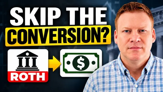
A man in a checked shirt looks flatly into the lens on the right, in front of a blurred building with columns. On the left, SKIP THE in white sits above CONVERSION? in black on a yellow bar, and under it two icons are joined by a yellow arrow: a bank building marked ROTH and a green banknote. The headline questions a common move and the icons show the money changing form, so the topic reads even to someone who does not know the term. The move: draw the jargon as two icons and an arrow.

A man with his hand on his chin squints sceptically from the right edge of the frame. Most of it is a laptop screen showing a local-business directory, six shopfront photos with star ratings and green Open tags, with banknotes spilling along the bottom. Across the top, $3,000/MONTH sits in white over 90 MIN/YEAR in white on a red bar. Two numbers that sound too good together, and a face that doubts them on the viewer's behalf. The move: pair the big claim with a doubting face.

A man in a dark T-shirt looks steadily into the lens on the left of a dim room with wood panelling. On the right, a stack of phone notifications reads Claude Ai, You received $79.00, Now, and across the bottom $321/day is set in large white type. The notification is a familiar interface, so it reads as a payment arriving rather than a claim, and the daily figure is the bigger promise. The move: show the payment as a notification.
Added on 3 November 2026
A day later, four more US money videos had risen through the week's searches. None of them uses the shocked face either. Two lean on a single target instead: an empty dealer lot and a retirement bar filled almost to ENOUGH. The other two swap a chart for a hand-drawn flow and an author's change of mind.
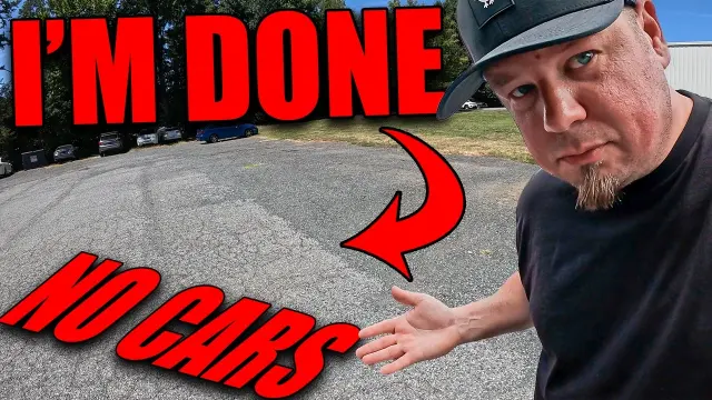
A man in a black cap leans in from the right with a sideways squint and an open palm held out over a mostly empty patch of tarmac, with a few cars parked along the far edge. I'M DONE in red block capitals runs across the top, and a curved red arrow drops to NO CARS slanting across the bottom. For a dealer, the empty lot is the problem itself, so the photo says more than a chart of inventory could. The move: photograph the problem itself.
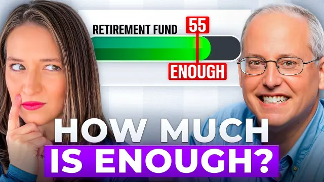
A woman on the left glances sideways with a finger on her cheek, and a grinning man in glasses fills the right. Between them, a progress bar labelled RETIREMENT FUND is filled green almost to the end, with a red marker at 55 above and ENOUGH below. HOW MUCH IS ENOUGH? sits across the bottom, so the bar shows the answer the title promises, and the two faces disagree about it. The move: turn the target into a progress bar.
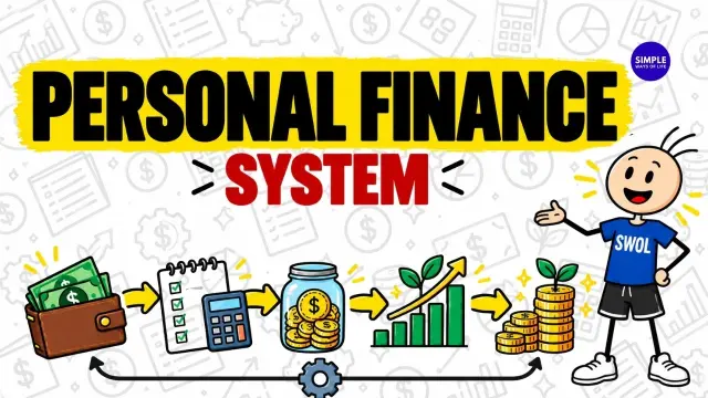
Everything is drawn: PERSONAL FINANCE in black on a yellow brush stroke, SYSTEM in red below, and a row of icons joined by yellow arrows, a wallet, a checklist and calculator, a coin jar, a rising bar chart and a stack of coins with a sprout. A gear and a loop arrow run underneath, and a grinning stick figure in a SWOL shirt presents it all. The frame is the system the title promises, laid out as a flow you can read in one sweep. The move: draw the process as a loop.
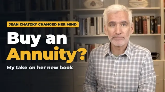
A grey-haired man in a checked shirt looks level at the camera in front of a bookshelf, with the left side darkened for text. A yellow tag reads JEAN CHATZKY CHANGED HER MIND above Buy an Annuity? in white and yellow and My take on her new book in small type. Instead of an expression, the frame borrows a known author's change of mind, and the plain, calm setting matches a review rather than a pitch. The move: let someone else's change of mind be the hook.
A brief you can use on your next finance video
- Write the claim in one sentence, then decide which single object proves it: a chart with one thing done to it, a place, a gesture or a figure.
- Choose the expression to match the advice. Caution gets a considered face. Save the shock for news that really is shocking.
- Search your topic and count the red lines in the results. If most of the row is charts, a photograph of a real place or a single gesture stands out.
- Cut the words to what the title doesn't say. If your headline is a question, make sure the video answers it.
- Check the numbers. Every figure in the frame should appear in the video, explained.
How to find out whether any of this works for you
None of these frames proves a pattern works, and your audience is not theirs. YouTube's A/B testing feature lets you compare up to three thumbnails on the same video and picks a winner by watch time share rather than click-through rate, which protects you from a frame that earns clicks the video can't keep. Our A/B testing guide covers how to design a test you can learn from, and the thumbnail preview tool shows whether your chart labels survive at the sizes YouTube really uses.
What to take from this set
This week's US finance feed is full of the same props: charts, cash and serious faces. The frames that stand out do one thing differently with them. A line changes colour, a chart becomes a race, a market crash becomes a shadow, or there is no graphic at all and just a real place. None of that proves the image earned the views. It does give you a short list of moves to try on your own channel.
To see all twelve with a short note on each, go to the finance gallery, and our finance thumbnail page has layouts and palettes for the niche. When you know what your one move is, Thumblore generates original 1280×720 thumbnails from a description of your video, so you get the structure without borrowing anyone's image.