

Key takeaways
- Seven of these twelve trending fitness thumbnails put a number in the frame: a weight, a heart rate, a session length, a race clock, a leaderboard, a class length or a timescale.
- Four use no headline at all and rely on one moment instead: a grimace, a rep, a finish line, a celebration.
- Red is still the default accent, in six of the twelve. It is safe, and it is crowded.
- There is no before-and-after here, and that is our filter, not a trend. We leave out body-transformation frames and frames built on a health result.
- View counts do not prove a thumbnail caused anything, and nothing here is training or health advice. Borrow the structure, never the image.
Updated 6 November 2026: 7 newer thumbnails were added to this set in two batches. The counts below describe the original twelve from 2 November; the new ones are in Added on 6 November 2026 and Added on 3 November 2026.
Fitness thumbnails have a credibility problem. Anyone can claim a workout works, so the frame has to show something the viewer can believe: a body, a time, a number, a moment of real effort. We took twelve of the past week's most-viewed fitness uploads from US channels, which you can browse in the fitness thumbnail gallery, and looked at what each one offers as proof.
This is a companion to our guide to designing fitness thumbnails, which covers lighting, physique shots and text. That guide is about how to build one. This one is about what is in the feed right now, and it is part of our wider trending thumbnails series.
How this set was chosen
YouTube has retired its general trending page, so there is no official fitness chart. On 2 November 2026 we ran seven fitness searches (workout, weight loss transformation, bodybuilding, running training, gym routine, powerlifting and home workout) with the region set to the United States, and took among the most-viewed uploads of the past week. The region setting changes YouTube's interface but not whose videos rank, so we kept only channels whose About page lists the United States as their country, then narrowed by hand to one video per channel. This is Thumblore's selection, not a YouTube ranking.
Hand selection means some popular videos are missing on purpose. We left out body-transformation frames and frames built on a health result, because we don't want to present a weight loss or a body as a design trick. We also left out a frame that appeared to show an AI-generated image of a real person, a frame inviting speculation about a named athlete's drug use, children's workout channels, and channels that list the US but make videos for audiences elsewhere. A channel's country is whatever it reports about itself, so treat the filter as a good approximation rather than a guarantee.
A view count does not show that a thumbnail caused the views. The top video here has more views than the other eleven put together, and that says far more about the channel's audience than about the frame. Click-through rate is the closest measure of whether an image earned a click, and only the creator can see it. YouTube's guidance on impressions and CTR explains why even that varies widely, and our piece on what counts as a good CTR goes further.
Numbers you can check
Seven of the twelve put a figure in the frame. In a niche full of claims, a number is something the viewer can hold you to.
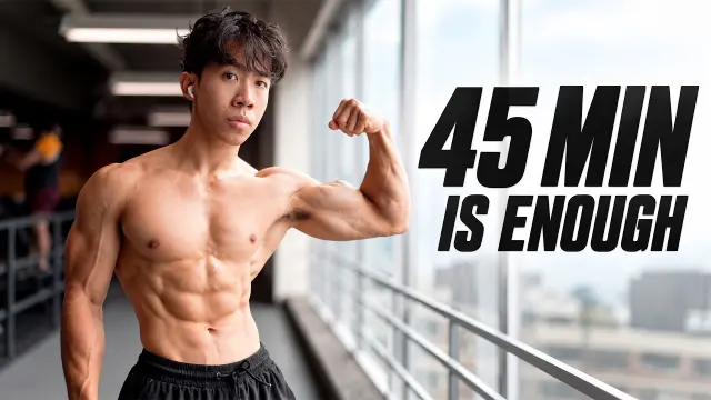
TylerPath pairs a body with a time. A lean, shirtless young man flexes one bicep by a gym window and looks straight at you, beside 45 MIN IS ENOUGH in heavy black italics against the bright sky. The physique is the evidence and the number is the promise, so the frame answers both "does it work?" and "how long will it take?". The title's "It Feels Illegal" adds the attitude.
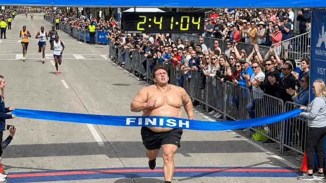
Tyler Speers lets a race clock make the joke. A runner in a padded fat suit breaks the blue FINISH tape under a clock reading 2:41:04, with a cheering crowd behind the barriers and other runners further back. There is no added text. The time is what makes the picture surprising, and it is part of the scene rather than laid on top of it.
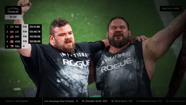
Martins Licis uses the event's own graphics. Two strongmen in Rogue Invitational shirts celebrate with their arms raised, one of them roaring, under a broadcast clock and a leaderboard of names and finishing times. Nothing has been added, so the frame reads as live footage, and the leaderboard backs up the "2nd" in the title.
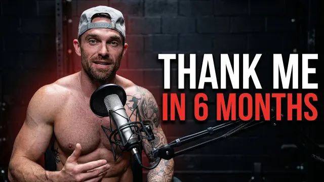
The True Transformation Podcast makes the number a deadline. A shirtless host in a backwards cap sits at a podcast microphone, gesturing at himself with a half-smile against dark brick, beside THANK ME in white and IN 6 MONTHS in red. The words make a promise with a date on it, and the physique beside them is the evidence that he can keep it.
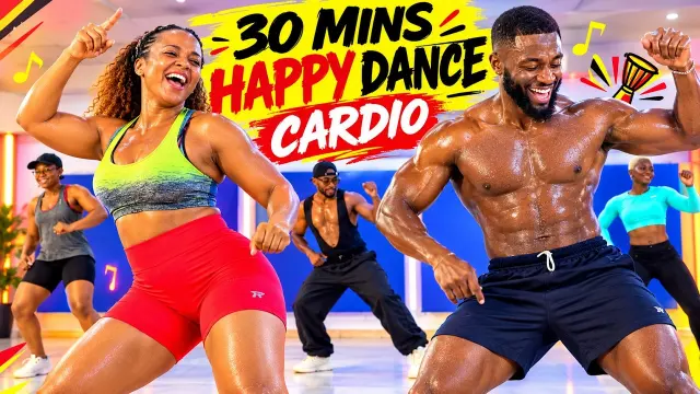
Vibe and Tabata puts the class length first. Two lead dancers grin mid-move in a bright studio with three more behind them, under 30 MINS HAPPY DANCE CARDIO in black, red and white on a yellow brush stroke, with music notes and a drum around it. The number tells you the commitment, and every other element says fun before effort, which is the promise of a dance workout.
Anatoly's 150LBS tag and Linda Sun's heart-rate readings, below, are the other two. The move: if your video has a real number in it (a time, a weight, a length, a result), put it in the frame, large, and make sure the video delivers it.
One moment, no headline
Four frames have no added words at all. Each relies on a single moment that explains itself.
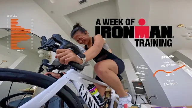
Linda Sun's camera sits low at the front wheel of an indoor bike and catches her eyes screwed shut, teeth clenched, in a bright white room. Orange split charts and heart-rate figures float around her like an app screen. The title says "i might quit", and the frame backs it up with both a face and data.
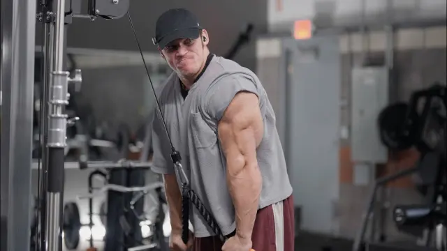
Sam Sulek's frame is a still from the vlog: a mid-rep cable pushdown with a side glance and puffed cheeks, the tricep catching the light against a blurred gym. There is no text and no graphic. The title names "the horseshoe", the shape of a developed tricep, and the frame shows it, so it reads like a moment from the video and not an advert for one.
The move: if you have one honest moment of effort on camera, it may need no words. Choose the frame where the effort is most visible, and let the title supply the context.
Stories with a face at the centre
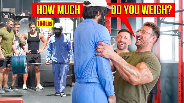
Anatoly's is by far the most viewed in the set. A muscular man in an olive T-shirt laughs as he grabs a slight figure in blue janitor's overalls from behind, while lifters watch beside a loaded barbell and a second janitor stands by. HOW MUCH DO YOU WEIGH? fills a red speech bubble, and a small 150LBS tag points at the janitor. The speech bubble gives you the setup of the prank, and anyone who knows the channel knows who is really in the overalls.
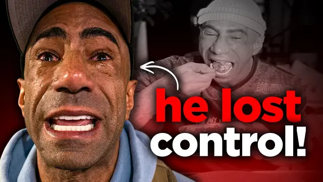
Coach Kolton tells a story in two pictures. A tearful face fills the left of the frame, mouth wide, while a grey inset behind shows a man eating, and a white arrow links the two above "he lost control!" in red and white lower case. The colour face is the present and the grey inset is the cause. Greying out the earlier moment is a simple way to show time passing without a before-and-after split.
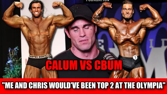
Nick's Strength and Power brackets a reflective face between two rivals. Two matching stage poses sit either side of a man at a microphone with his eyes lowered, and that quiet centre is what stops this from being a simple head-to-head. "CALUM VS CBUM" and a full-width red band carrying a quote are loud enough to survive shrinking, though at well over five words the band repeats much of the title.
The move: when the video is a story about people, put the speech bubble, the arrow or the matchup in the frame, so the viewer can see the setup before reading the title.
Make it look doable, or make it look right
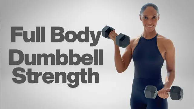
MrandMrsMuscle's is the calmest frame in the set. A woman in a black jumpsuit curls a dumbbell and smiles at you on a plain light-grey ground, beside Full Body Dumbbell Strength in large grey type. For a follow-along workout, that restraint is the point: it tells you what equipment you need and what you'll do, and nothing about it looks intimidating.
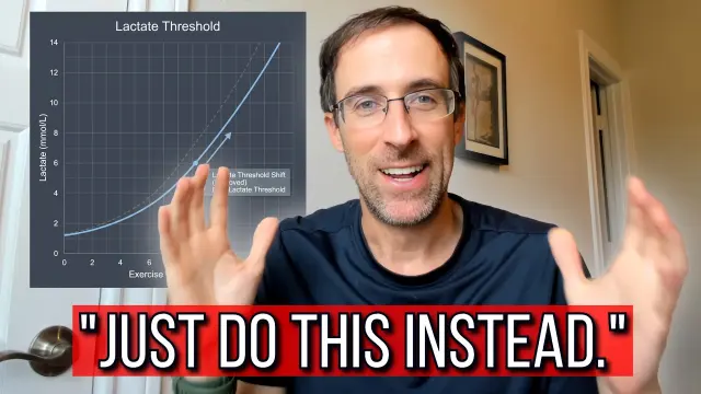
Steve Magness goes for authority. A lactate chart on the left says this is serious, his open-handed smile says it is approachable, and a red banner reading "JUST DO THIS INSTEAD." implies you are doing it wrong. The title sets out the topic, while the banner gives you the reason to want it without saying what "this" is.
The move: match the frame to what the viewer is searching for. A follow-along needs to look doable. A training explainer needs a credibility prop, such as a chart, and a correction.
What the twelve have in common, counted
We counted these from the images, so you can check them. Classification is our own judgement, and with only twelve frames it describes this set and nothing wider.
| Observation | Count | Which ones |
|---|---|---|
| A number or time in the frame | 7 of 12 | Anatoly, Linda Sun, TylerPath, Tyler Speers, Martins Licis, Vibe and Tabata, The True Transformation Podcast |
| No added headline | 4 of 12 | Linda Sun, Sam Sulek, Tyler Speers, Martins Licis |
| Five words or fewer, where there are words | 7 of 8 | All except Nick's Strength and Power |
| Red as the main graphic colour | 6 of 12 | Anatoly, Nick's Strength and Power, Steve Magness, Coach Kolton, Vibe and Tabata, The True Transformation Podcast |
| Smiling at the camera | 4 of 12 | Steve Magness, MrandMrsMuscle, Vibe and Tabata, The True Transformation Podcast |
| Before-and-after split | 0 of 12 | None, by our selection |
Our classification into the six layout patterns came out as four Reveal, three Number, two each of Reaction and Warning, and one Versus. Before / After is at zero because we left those frames out, not because the niche doesn't use them.
Do fitness thumbnails need a shirtless physique?
This set doesn't support that. Several show a bare torso, but others show a gym prank, a lactate chart, a race finish and a broadcast leaderboard. A physique is one kind of evidence. Pick the one that proves your video's point.
Can I put a time or a weight on my thumbnail?
Yes, and most of this set does. Keep it to one figure, make it large and be sure the video delivers it. YouTube's thumbnail policies prohibit thumbnails that mislead viewers about the content, and a time you didn't run is an easy way to do that.
Added on 6 November 2026
Three days later, four more US fitness uploads, and still no before-and-after. Two put a number in the frame, one shows a whole team at a start line, and one leaves the result of a marathon open.
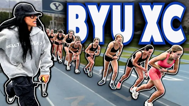
A long line of college runners crouches at a start line on a blue track, stretching back toward the BYU stadium, while a woman in a grey hoodie, cap and dark glasses stands in the left foreground with a stopwatch. BYU XC is set across the top right in huge white capitals outlined in blue. The receding line shows the size of the team, and the school's name tells running fans exactly whose session this is. The move: show the whole group at the start line.
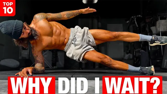
A tattooed man in a beanie and grey shorts holds a side plank on one forearm with his top arm and leg raised, stretched across a dark gym. A red TOP 10 badge sits in the top-left corner, and WHY DID I WAIT? runs along the bottom in white on red blocks. The pose is the exercise itself, held at its hardest point, and the headline is a confession rather than an instruction. The move: freeze the move at its hardest point.
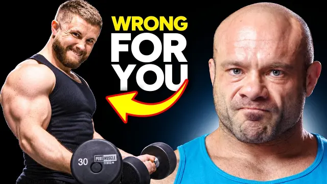
On the left, a muscular man in a black tank top grimaces through a dumbbell curl, the weight marked 30. On the right, a bald man in a blue tank top stares at the lens with a flat, unimpressed look. Between them, WRONG FOR YOU in yellow and white sits above a yellow arrow pointing back at the curl. The arrow decides who is being judged, and the deadpan face is the verdict. The move: let an arrow pick the target.
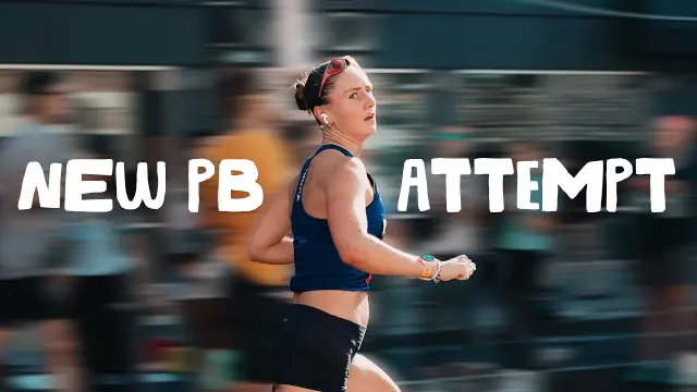
A runner in a navy vest and red headband glances sideways mid-stride in the centre, sharp against a crowd of other runners blurred by motion. NEW PB on the left and ATTEMPT on the right are written in rough white brush capitals on either side of her. The blur gives the frame race-day speed, and the word attempt leaves the result open, which is the reason to watch. The move: leave the result open.
Added on 3 November 2026
A day later, three more US fitness videos had climbed the week's searches. Two use no added words at all, which brings the no-headline frames in this set to six. The third is the plainest follow-along frame yet: a session length, a body part and a smile. We left out several frames built on body transformations or AI-looking images of real people, under the same rules as the original twelve.
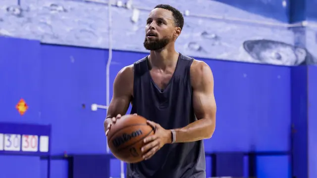
Stephen Curry, in a dark sleeveless top, holds a basketball at his chest and looks up past the camera towards a hoop we never see, in a gym with deep blue walls and a pale mural above. There is no text, no arrow and no colour grade. For a player this well known, the familiar face and the shooting stance are the whole pitch, and the title only has to say where he is. The move: if the face is famous, add nothing.
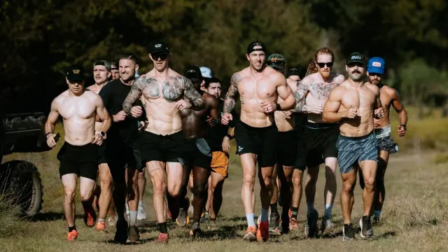
A pack of runners, most of them shirtless and tattooed, in caps and sunglasses, comes straight at the camera down a grass trail, with the crowd behind them fading back into the trees. There are no added words. The frame shows a group rather than one athlete, so the title's 200 People reads as true before you count, and the shallow focus makes the course feel long. The move: shoot the crowd coming at you.
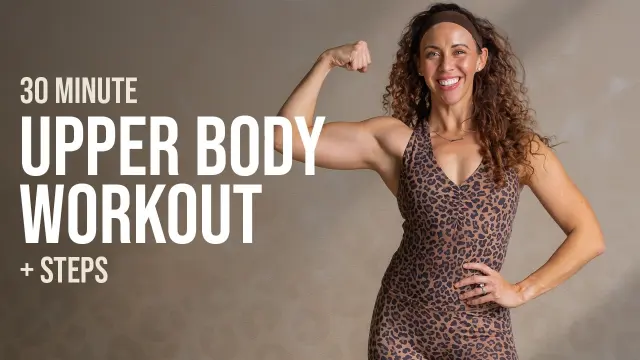
A smiling instructor in a leopard-print top flexes one arm with her other hand on her hip, against a warm grey wall, beside 30 MINUTE, UPPER BODY WORKOUT and + STEPS stacked in cream type. The palette is muted and the type is plain, so the frame says what you'll do and for how long, and nothing looks intimidating. The move: state the length and the body part, plainly.
How to use this on your next video
- Find the proof. Decide what in your video a viewer can believe: a number, a moment of effort, a result, an event.
- Pick one move from above: the number, the single moment, the speech bubble, the doable layout or the credibility prop.
- Choose red only if it earns its place. Half this set uses it, so leaving it out can help you stand out.
- Cut the words to five or fewer, and make sure they add something the title doesn't.
- Test it. YouTube's A/B testing feature compares up to three thumbnails and picks a winner by watch time share, and our A/B testing guide explains how to set one up.
Borrow the structure, not the image
The moves above are structures: a number as the promise, a race clock as the punchline, a greyed-out cause. Copying someone's actual body, photo or layout is a different act, and it tells viewers they have already seen your video.
The short version
This week's US fitness feed rewards proof. Race clocks, leaderboards, session lengths and honest moments of effort sit beside the usual physiques, and most of the frames keep their words to five or fewer. None of that proves any image caused its views. It does suggest that the question to ask of a fitness thumbnail is "what here can the viewer believe?".
To see all twelve with a short note on each, go to the fitness gallery, and our fitness thumbnail page has layouts and palettes for the niche. When you know what your proof is, Thumblore generates original 1280×720 thumbnails from a description of your video, so you get the structure without borrowing anyone's image.