

Key takeaways
- Seven of these twelve trending gaming thumbnails have no headline at all. The four with a headline use two words or fewer, and all four put them along the top of the frame.
- Ten of the twelve set two things against each other: a player and a monster, a car and a bug, a hose and the sun. The click resolves the gap between them.
- A real face appears in five of the twelve, and only one of the five is screaming. The two most-viewed videos in the set show no real face.
- The same topic can produce very different frames. Two 10,000-player Minecraft wars sat in the feed on the same day, one built on scale and the other on a duel.
- Views do not prove a thumbnail caused the views. Only the creator can see click-through rate, so treat every example here as a structure to test, never as a recipe.
- Borrow the structure, not the image. The layout, the framing and the kind of promise are yours to use. The picture belongs to the creator who made it.
Updated 6 November 2026: 8 newer thumbnails were added to this set in two batches. The counts below describe the original twelve from 2 November; the new ones are in Added on 6 November 2026 and Added on 3 November 2026.
On November 2, 2026 we took a snapshot of YouTube's own gaming trending feed and went through its thumbnails by eye. Twelve made the final set, and you can see them all on one page in the trending gaming thumbnails gallery. This article is the long version: what is actually in each frame, why the eye lands where it does, and what you can take from it without copying a pixel.
The usual advice about gaming thumbnails says big face, open mouth, bright colour, three bold words. Some of that holds up in this set. A good deal of it does not. Most of these frames have no headline, most have no human face, and one of the most striking is a quiet illustration of someone crouched over a campfire.
That does not make the usual advice wrong. It means the feed has more room in it than the advice suggests, and that a thumbnail is a decision about one video, not a template applied to all of them. The other categories are collected on the trending thumbnails hub, but gaming is the one with the widest spread of solutions, so it rewards a slow read.
How this set was chosen, and what it cannot prove
Every video here came from YouTube's gaming trending feed for the United States on the capture date. YouTube announced in July 2025 that it was retiring its general Trending page in favour of category charts and personalised recommendations, with Gaming Explore listed as part of what replaced it, so this gaming feed is YouTube's own and not an estimate of ours.
From there the selection is ours. We narrowed the feed to one video per channel, and left out anything that was sexual or graphic, featured children as the subject, or was built around a real person's misfortune or a crude stereotype. The order you see below and in the gallery is our editorial judgement, based on what each frame teaches and how much variety it adds. It is not YouTube's ranking and it does not follow the view counts.
Now the part that matters most. A view count does not prove a thumbnail caused those views. A video's numbers also reflect its topic, its title, the size of the channel's audience and how long it has been up. In this set the newest video had been live for about seven hours at capture and the oldest for about a day, so the raw figures are not even a fair race. The one number that speaks directly to a thumbnail's pull is impressions click-through rate, and only the creator can see that in YouTube Studio. We do not have it for any of these videos, so nothing below claims that any design choice earned any result. It describes what the frames do. It cannot say how well each choice worked.
Borrow the structure, not the image
Every thumbnail here belongs to the creator named beneath it. Lifting one, tracing it or feeding it to a tool and asking for a near-copy is not what this article is for. Take the layout, the framing and the kind of promise being made, then build your own picture around your own video. Our thumbnail copyright guide covers where the lines sit.
The whole set at a glance
Before going frame by frame, here is the set in one table. The pattern column is our own classification into six layouts. "Real face" means a photographed person, not a game character. "Added words" means type laid over the image, not signage or text that belongs to the scene, and it ignores tiny artist-style credits.
| # | Channel | Game or setting | Pattern | Real face | Added words |
|---|---|---|---|---|---|
| 1 | FlameFrags | Minecraft | Versus | No | None |
| 2 | TechyCrew | GTA 5 | Before / After | No | CRASH, EVOLVE |
| 3 | SSundee | Roblox | Number | No | 144,986°C |
| 4 | TG Plays | Fortnite | Reaction | Yes | NEW! labels only |
| 5 | Parrot | Minecraft | Versus | No | None |
| 6 | SMii7Y | Rocket League | Reveal | No | None |
| 7 | berleezy | Basketball court | Reaction | Yes | None |
| 8 | bizlychannel | Gas station | Reveal | Yes | None |
| 9 | 3FS | Dinosaur horror game | Warning | Yes | help me |
| 10 | Willjum | Rust | Reveal | No | None |
| 11 | CaseOh | Block world | Reaction | Yes | None |
| 12 | MadSeasonShow | World of Warcraft | Reveal | No | It begins. |
Read down the last two columns and the usual formula starts to look optional. Only one thumbnail here combines a real face with a headline, and it is the deadpan one.
Same topic, two answers: the Minecraft wars
The most useful comparison in the feed was an accident of timing. Two channels had a 10,000-player Minecraft war in the feed on the same day, with almost the same premise, and they answered the thumbnail question in opposite ways.
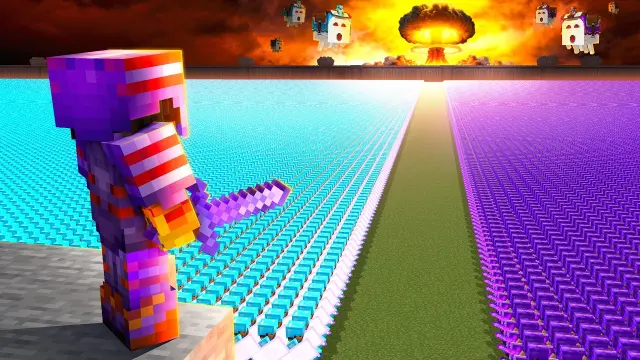
FlameFrags goes for scale. One armoured player stands on a grey ledge in the bottom-left corner with their back to us, and everything else in the frame is army: cyan on the left, purple on the right, in rows that shrink all the way to the horizon, where a mushroom cloud goes up against an orange sky with pale flying creatures around it. The strip of green between the armies is a road for the eye, running straight to the explosion.
The clever part is the player. Standing them in the foreground, facing away, gives you somebody to stand behind. You see the armies from their position, so the size of the thing registers as a feeling and not a fact. Without that figure the picture would be a pattern of coloured dots. There is no text in the frame, and it does not need any, because the title puts the number on what you have just seen.
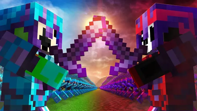
Parrot has armies too, but they are small and low in the frame. The subject is two hooded characters, one blue and one red, mirroring each other at the frame's edges with purple swords crossed exactly in the centre. A flare of light sits at the crossing point, and the sky shifts from blue to blood red behind them. Each half of the picture is one side of the title's Nether VS Overworld.
So the first frame says "look how big this is" and the second says "these two sides are about to collide". Neither has words or a real face. The transferable point is the choice itself: when your topic is crowded, the thing to decide first is which feeling your frame is selling. Colour coding is what makes both of them readable, since each side gets one colour and keeps it. Our Minecraft thumbnails guide goes further into how to make blocky scenes hold up at small sizes.
Explain the rule of the video in two words
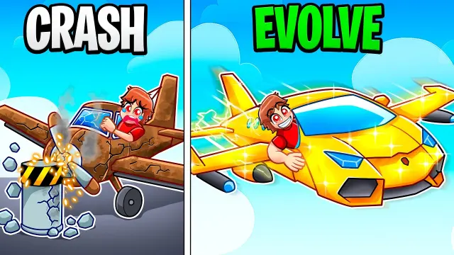
Challenge videos have a problem: the premise is often a sentence long and a thumbnail cannot hold a sentence. TechyCrew compresses it into two words and one line. A hard vertical divider splits the frame. On the left, under CRASH, a rust-brown propeller plane with cracked wings hits a concrete block as its pilot cries. On the right, under EVOLVE, a gold plane crossed with a sports car glitters in clear sky as the same pilot grins out of the window.
You understand the rule before you read the title, and the before-and-after gives you an obvious question: what does the next one look like? Notice also what is missing. Nothing in the picture looks like GTA 5. The frame is a bright cartoon and the game's name is left to the title, so the thumbnail sells the idea and the title supplies the context. It is a useful division of labour for any challenge format where the concept is stronger than the game footage.
Use a number to make the task absurd
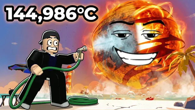
Numbers in thumbnails are usually there to brag: a subscriber count, a sum of money, a world record. SSundee uses one to set up a joke. A Roblox figure in a black suit braces with a garden hose against a sun parked just off a beach, with a smug face on it and one side already steamed to grey. Top left, in big white type with a heavy black outline, is 144,986°C.
That number appears nowhere in the title, which only says I Must DESTROY The Sun in Roblox. So the thumbnail and title each contribute something the other does not. The title gives you the goal. The picture gives you the hopeless tool. The number tells you how hopeless, in a way that is funny because it is so exact. A round figure would probably be a weaker joke; a specific one reads as if somebody measured it.
Three faces doing three different jobs
The screaming creator is the most mocked convention in gaming thumbnails, and it is present in this set exactly once. The other faces do something else, and the differences are worth studying if you appear on camera. For the deeper version of this question, our gaming thumbnails guide works through what a face is for across the category.

Here is the full version of the convention, and in context it makes sense. TG Plays grips his cheeks and screams on the right. In the centre, Luffy holds a crackling gold multi-barrel gun, his straw hat overlapping a Victory Royale banner. Along the bottom run three tiles marked NEW!, each showing an item. This is the busiest frame in the set, and it is also an update video, so the density is doing a job: the tiles are effectively a picture of the patch notes the title lists in brackets. Excitement is what the viewer has come for, so the scream is honest about the video's tone.
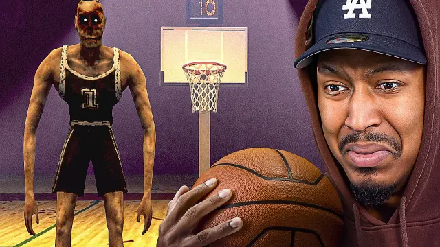
Berleezy is holding a basketball and looks as if he would rather not be. His expression is a doubtful grimace with his lips pushed together, aimed at the viewer. On the left of the frame stands the reason: a long-armed, low-poly player with glowing eyes in a number 1 jersey, waiting on the court. The face does the emotional work, and it is the precise emotion the title describes. HOOPING FOR MY LIFE is a joke about reluctant dread, and a big scream would have been louder and less funny.
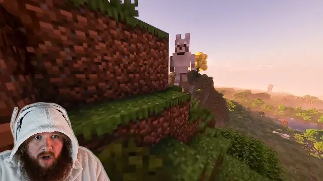
CaseOh's frame is the least dressed of all twelve. It looks close to a raw game capture, with a steep wall of grass and dirt blocks taking up the left and a warm dusk landscape falling away to the right. A wide-eyed facecam in a white hood sits at the bottom left, and on the ridge stands a small, pale, upright creature with pointed ears. You have to look for it, which is unusual, because most thumbnails do the opposite and enlarge the interesting thing until it fills the frame. Here the title has told you this is no regular dog, and your eye goes hunting. Whether that restraint would work for a smaller channel is an open question, and it is a good one to test, because a known face may be doing a lot of the work.
Do trending gaming thumbnails need a face?
No. Five of these twelve show a real face and seven do not, and the two highest view counts in the set belong to frames with no real person at all. That does not show faces are worse. It shows a game character can carry the same job when the video does not depend on its creator's reaction: a Minecraft skin, a cartoon pilot or a Roblox figure all give the viewer someone to look at. Pick by format. If the viewer is coming for your reaction, show it. If they are coming for the spectacle, show the spectacle.
Deadpan against the monster
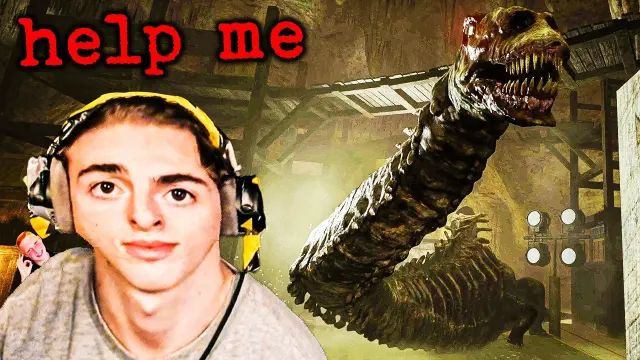
Horror is where the screaming face is most entrenched, which is why this one stands out. The creator looks straight into the lens with no expression, headset on, as a huge, toothy, long-necked creature rears up in a mine behind him. Top left, in rough red typewriter letters, it says help me. A tiny cut-out of a second person grins from the left edge.
The face and the words pull against each other, and so do the face and the monster. That mismatch is the entire tone of the video in one image: you learn that this is horror played for laughs before you have read that it was a HORRIBLE idea. The general lesson is that an expression can contradict the scene on purpose. Contrast is one of the few things that still surprises in a category where the conventions are this settled.
Make the intruder the subject
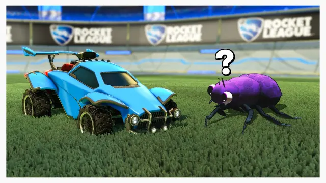
SMii7Y's frame is as close to a one-line joke as a thumbnail gets. A blue Rocket League car sits on the pitch beside a purple bug with googly eyes, and the two are about the same size. There is a question mark over the bug. The stadium boards are out of focus behind them, and they are the only place in the entire set where a game's name is plainly printed in the picture.
Everything about this is simple on purpose. Two objects, lots of clean green, a thin pale border around the whole image, one piece of punctuation. The title, Rocket League but with Bugs, is the caption, and between them they do what a cartoon does: picture plus line equals joke. If your video's premise is "game X but with Y", this is the most direct structure there is. Put the familiar thing and the strange thing side by side and let the viewer's expectation do the rest.
Show somewhere ordinary and let the title accuse it
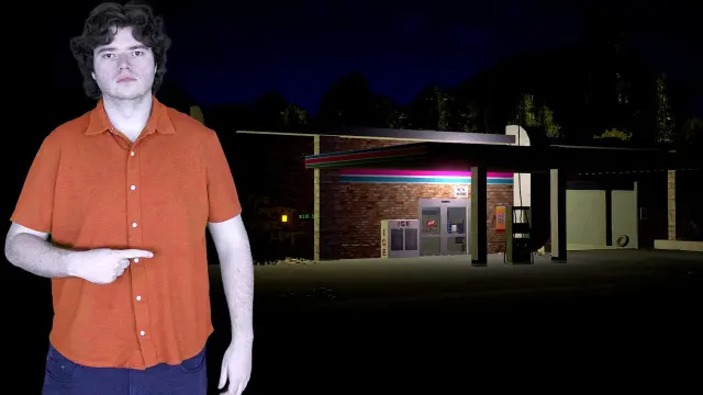
The title says this gas station is terrifying. The picture shows a gas station. It is night, the building is dim, a pink and cyan stripe runs along the roof, and a man in an orange shirt stands against near-black, pointing at it with no expression at all. There is no monster, no blood and no red circle.
That restraint creates the question. If the frame showed what was frightening, there would be less reason to click. Instead you are told something ordinary is frightening and given nothing to confirm it, so the only way to find out is to watch. The colour works hard too: the orange shirt is by far the largest warm patch in the frame, and his pointing arm is a plain arrow to the only other point of interest. Analogue-horror-style videos could borrow this straight away, because they depend on dread and a frame that gives everything away undercuts it.
Sell a mood, not a moment
Two thumbnails in the set have no clash, no threat and no reaction in them. They are worth reading together.
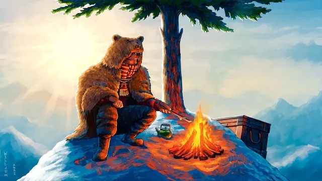
An illustrated figure in a bear hide and striped scarf crouches over a campfire on a snowy peak, holding a stick to the flames. There is a kettle beside the fire, a wooden chest behind it and one tree overhead, with the sun flaring through haze on the left. Two tiny vertical credits sit at bottom left. None of this says Rust, and neither does anything else in the frame. In a feed full of screenshots it looks more like a book cover.
What it sells is a character: someone alone, self-sufficient and at ease at the top of a hostile world. Set that beside the title's 15,217 hours and the number stops being a statistic and becomes a biography. This is an expensive move to copy, since illustration takes time or money. It is also a recognisable one, because a run of frames in a single illustrated style looks like a series even before anyone reads the channel name.
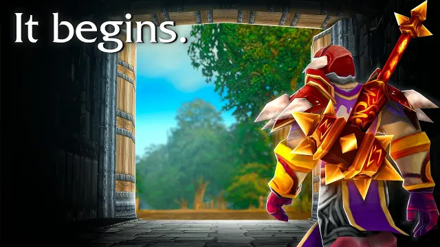
MadSeasonShow's frame does have a game character, seen from behind in ornate red, gold and purple armour, walking through a dark gateway towards a bright forest. The words It begins. sit top left in a quiet serif. The dark surround acts as a natural vignette, and your eye goes through the opening with the character.
The type choice is the part to notice. The other three headlines in this set shout in heavy type or alarm red. This one sits there like the opening line of a novel, and that suits a video called The Dawn of World of Warcraft Forever. The audience for this kind of video may well arrive with feelings about the game already, so the frame only has to touch them and does not need to explain anything.
What is actually true across all twelve
Set aside the individual frames and four things hold across the whole group. All of them come from counting what is visible, and none is a claim about performance.
- Words are the exception. Seven frames have no headline or labels. Four have a headline of at most two words. TG Plays uses three identical NEW! labels instead of a headline.
- Headlines sit high. All four sit along the top of the frame, clear of the bottom-right corner where YouTube prints the duration. Three of them add something the title does not say. Only TechyCrew's echoes its title, and even that compresses it.
- Two things beat one. Ten of the twelve place two subjects in tension. Willjum and MadSeasonShow are the exceptions, and each uses a single figure in a much bigger setting.
- The game is often implied, not named. Only SMii7Y's frame has a game's name plainly printed in it. Elsewhere the world's look, such as Minecraft's blocks, does the identifying, or the title takes over.
Added on 6 November 2026
Three days later, four more frames from YouTube's US gaming feed. Two have no real face at all, IGN's review leads with its score, and two creators made their own face part of the joke: one cut into sliding tiles, one hiding a letter of the headline.
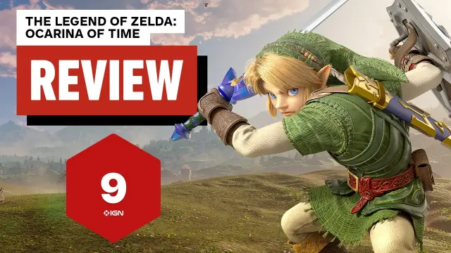
Link fills the right two-thirds of the frame mid-swing, sword raised and shield on his back, against green hills and a blue sky. On the left, the game's full name sits in black on a white tab, REVIEW in white on a red block below it, and under that a red hexagon carries a large 9 with the IGN logo. The score is the review's conclusion, so a viewer deciding whether to buy has the answer at feed size and clicks for the reasons. The move: put the verdict on the cover.
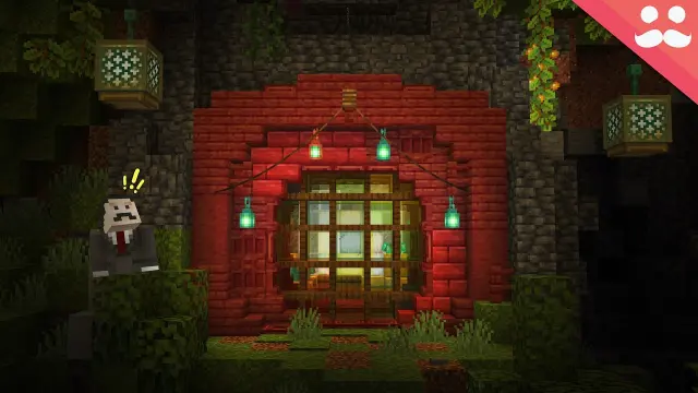
There are no words. A red-brick arch is set into a dark, mossy cave wall, with a round, glowing lattice door at its centre and green lanterns hanging on either side. A small blocky figure in a suit and moustache stands at the left with two yellow exclamation marks over his head, and a pink corner tab carries the channel's moustache logo. He is a fraction of the door's height, which makes the build look enormous, and the door is the only bright thing in the frame. The move: shrink the person to make the build big.
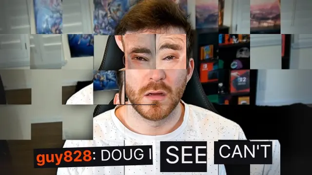
A streamer sits in a gaming chair in his room, but the whole frame has been cut into square tiles and shuffled. His eyes sit above the rest of his face and out of line with it, some tiles are blank grey, and pieces of the posters behind him are in the wrong place. Along the bottom, a chat message reads guy828: DOUG I, followed by two loose tiles reading SEE and CAN'T in the wrong order. The thumbnail is the half-solved puzzle the title describes. The move: make the frame do the video's gimmick.

A bearded presenter in glasses frowns slightly in front of a dark studio washed in red. CLONED runs the full width of the frame in heavy white capitals, but his head covers the O, which shows only as a thin outline, and a red starburst follows the last letter. A small GMTK logo sits in the top-right corner. One word states the problem, and the missing letter makes it look as if something has been taken. The move: let the face interrupt the word.
Added on 3 November 2026
A day later, four more US channels had reached the gaming feed. Two of them break this article's counts: Joe Bart Games puts its headline along the bottom of the frame, and Top5Gaming points a red arrow at a single word. The other two have no words at all, which matches the twelve above.
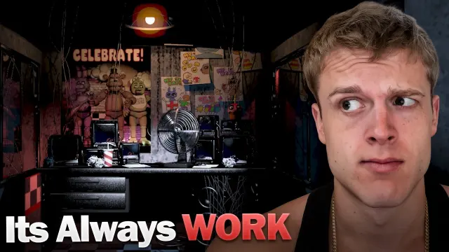
A creator in a black vest fills the right half and side-eyes a dark security office: monitors, a desk fan, a striped drink cup, a CELEBRATE! poster and three animatronics waiting on a stage behind. Along the bottom, Its Always sits in white and WORK in red, so the frame answers the title's question before the video does, and the raised eyebrow sets up an essay rather than a scare. The move: answer the title's question in the frame.
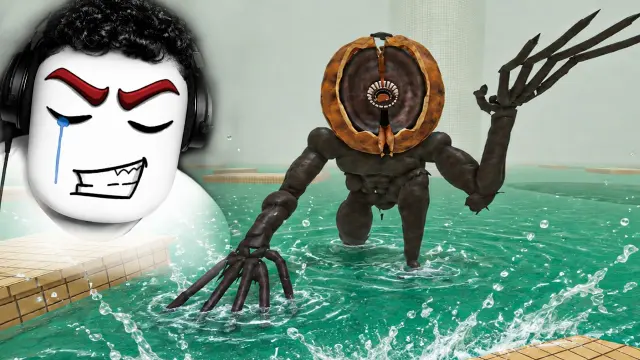
At top left a flat Roblox face with angry red brows, one blue tear and a gritted grin is pasted over a head of curly hair and headphones. Beside it, a long-limbed brown creature with a split, shell-like head and a single eye rises out of a turquoise pool and reaches for the tiles. There are no words at all: the title gives the rule, Do NOT Touch The Water, and the creature shows what breaking it costs. The move: show the cost of breaking the rule.
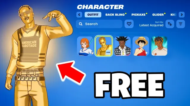
A gold Fortnite outfit poses on the left with a big red arrow aimed at it, and the right side is the game's own Character locker, with that outfit highlighted in a row of five tiles. A single white word, FREE, sits at bottom right. The menu makes the frame feel like a screenshot of your own game, so the claim reads as something you could go and check. The move: use the game's own menu as proof.

A thin black bar splits a tiny green planet ringed with trees, a red vein already running through its soil from one small creature, from a huge red planet of swollen flesh and tentacles on a starry background. With no text and no face, the size jump between the halves tells the whole story of the title's i infected earth with a parasite. The move: make the after much bigger than the before.
How to use this on your own next video
The risk with any gallery is that you pick the frame you like most and copy its look. A better route is to start from your video and work back. These five questions come straight from what this set does:
- What is the one feeling? Scale, dread, excitement, curiosity, a joke. FlameFrags and Parrot show that one topic can take either of two feelings, and you have to pick.
- What are the two things? Name the subject and whatever it is in tension with. If you cannot name a second thing, consider whether one figure in a bigger setting would work.
- Who is the viewer coming for? If it is you, show your face, and choose the exact expression the video calls for. If it is the spectacle, a character can stand in.
- Do you need words? Try it without any first. If you do add them, keep to two and make them say what the title does not.
- Does it survive at feed size? Check it small before you commit. The free thumbnail preview tool shows your image at real YouTube sizes.
The gaming thumbnail page sets out layouts and design rules for this category if you want a starting structure to work from.
Test it on your own audience
None of these frames can tell you what works on your channel, but YouTube can. The Test & Compare feature lets you try up to three thumbnails on one video. YouTube's Help page says it optimises these tests for overall watch time rather than click-through rate, on the reasoning that good packaging should help viewers understand a video so they do not click on something they will not enjoy. A test ends with one of three results: Winner, Performed Same or Inconclusive. It is not available on Shorts, on videos made for kids or on videos for mature audiences, among others, so check the page for current eligibility.
This matters for the frames above. A thumbnail that wins the click and then disappoints is not doing what the test measures, and it is exactly the trap a dramatic gaming thumbnail can fall into. The gas station frame and the deadpan horror frame both make a promise about tone. The test is whether the video keeps it.
When you read your own numbers, use YouTube's click-through rate guidance as your baseline. It says half of all channels and videos have an impressions CTR between 2% and 10%, that a lower rate is natural when a video is being shown widely on the Home page, and that you should not react to small movements straight after uploading. It also says to compare over the long term and account for traffic sources. That is a useful corrective to reading too much into a single figure, whether it is yours or somebody else's view count.
The short version
The trending gaming feed on this particular day was not one style on repeat. It held an illustrated campfire, a hose aimed at the sun, a deadpan stare in front of a monster and a bug next to a car. The common thread is not a look. It is that each frame made a decision about one specific video: what the viewer should feel, and what they should be left wondering.
That is what to take away, and it is why you should borrow structure and leave the images alone. Go through the full gallery of trending gaming thumbnails with your next video in mind, note the one move that fits it, and build your own frame around that. Thumblore generates original thumbnails from a description of your video if you would like a fast way to try several versions, and then the only remaining question is the one no gallery can answer, which is what your own audience does with them.